Update (M3) for quick viewing, will be integrated into the rest afterwards - PDF
Current Visualization
The current visualization (pictures in the presentation) implements the Squarified-FoamTree-Layout in which the clusters size represents its amount of subclusters. The clusters to the top left are the biggest and get progressively smaller towards the bottom right. Small clusters indicate that only very few clusters were similar and therefore are outliers.
The users are able to pan and zoom the viewport my using the mouse and mousewheel respectively. Double-clicking, clicking the plus-button or zooming in on a cluster triggers a inspection of that cluster. A swift transition occurs in which the cluster gets bigger until its bigger than the screen and becomes transparent in the process, revealing its child clusters.
The child clusters are layed out in the same way the parent clusters were and also the same control scheme applies. It is also possible to inspect a specific child cluster, which makes this process recursive. If the user zooms out far enough until a certain threshold is hit and the cluster only occupies a certain percentage of the screen, the parent clusters will be shown again and the same transition as before occurs, just in reverse. To go back one layer the user can also click the minus-button.
Prototype
Not included in the new visualization design were the parameter pane and comparison pane, because both did not change at all. The parameter pane allows the user to enter a range of parameters, displays the distribution of the data and allows for filtering by adjusting the sliders.
Implemented at the moment are the representation and controls for the result window, but not the Squarified-FoamTree-Layout. Also the parameter pane is completely functional only the comparison screen and visual comparison have to be added.
Changes
I overhauled the result window and decided not to use one of my initial designs. The parameter and comparison panes stayed the same.
Progress
As described in the "prototype" section the big parts missing are the comparison screen and some additional features to better help the user navigate the tree and provide more context.
As a later feature I plan on using parallelization for generating the plots.
Challenges
Calculating and producing the visual comparison is a major challenge and so is parallelizing certain aspects of the program further, i.e. the generation of the plots.
Members
Joseph Pober, error304@hotmail.de
Description
Target Application
GeneCalc allows users to visualize datasets through R-Apps. This helps people with little to no experience in programming to utilize R. Instead of actually programming the desired plot, one simply selects a visualization method (i.e. histogram) and enters the parameters into the provided text boxes. The problem is that this whole workflow only works with exactly one set of parameters at a time. Many user will want to test multiple ranges of parameters to find the desired result. Entering a set of parameters and then having to wait for the computer to finish the calculations does not only waste a lot of time it also interrupts the workflow of the user considerably. Solving this problem requires users to be able to enter ranges of parameters instead of only a single set. With this, a problem in presentation arises, since many results in form of complex objects may appear and have to presented to the user. This will most likely be done by clustering the results and only showing examples or averages of those clusters to the user. They can then choose a to inspect a cluster, which either shows all results of that cluster or shows again some sub-clusters of this cluster. Following the design principle of showing first an overview and only later zooming in and providing details.
Dataset
The data is a table consisting mainly of floats. Each row represents a gene and each column a cell type. The floats try to show the likelihood of a gene being responsible for a cell to form a certain cell type. Since this is real world data, there is quite a lot of noise and often multiple samples of the same type must be taken and recorded to be sure that the results are not distorted too much by noise.
The program is supposed to work with any data. The data described above is just used by the test users, since those are biologists.
Users
The users will have little to no programming knowledge, but want to have powerful visualizations of their data.
Tasks
Parameters
The current state of the program allows the user to access all available parameters for each visualization technique. Most of which users might not understand and are not necessary for the users to be able to change themselves. It is important to figure out which parameters should be presented to the user, which parameters should be set automatically, and which parameters could be hidden and only shown on demand.
Input
At the moment it is not possible to enter ranges for parameters or multiple sets of parameters at once. Since the goal of this project is to allow the program to accept multiple inputs and generate multiple outputs it is necessary for the user to be able to input the desired parameter ranges.
Automatically Set Values
Since users will be able to set ranges for parameters it is important to figure out a good step size automatically. It is also important to have well suited default parameters and to calculate as many parameters as possible automatically. This way the user does not have to understand everything about the visualization method of their choosing and still get reasonable results.
Show Randomness
Some processes involve randomness, like k-means clustering, this has to be communicated to the user, since multiple runs with identical input might result in different outputs. This also complicates saving models, since models with the same input might still be different or produce different outputs.
Representation of Results
Many complex objects at once are not easily presented to the user without them having to invest a lot of time to examine them all individually. It is therefor paramount to find a way to organize the output of the program in such a manner that users get first an overview of the generated output and then can request details for objects of interest. This will be the main focus and much more difficult than the other tasks.
Generalization
It is important that the input ranges and the representation of the output work for all visualization techniques and not only for a select few. This might be not as difficult once a general solution for a single problem is found.
Solutions
Parameters
A good solution would be to limit user input to control parameters and let the program itself decide the model parameters. The model parameters are still accessible by the user, but hidden until demanded and set by the program if left empty.
Input
This is actually quite easy. Instead of having one text box for each numeric parameter there would simply be two text boxes one named "start" and one "end". For non-numeric values one could use instead of drop-down menus and radioboxes simple check-boxes to be able to activate all desired options.
Automatically Set Values
The main concern is the step size of parameters with a range of values. The step size should be dynamic and focus on areas of maximum change. There should be big steps where there is little change and small steps when parameter values get into certain areas with big changes. This leads to an array of steps for each parameter instead of a fixed amount by which a parameter is incremented.
Show Randomness
One way of pointing out randomness would be to show the seed which is being used to calculate the output. This seed would also be saved so each time the user loads the model they get the same results. Users would also be able to manually enter a desired seed.
Representation of Results
There are certainly many different solutions to this problem, but I think a very intuitive solution would be trying to cluster the output into a manageable amount of clusters and presenting those clusters to the user instead of all results at once. To give the user an idea of how those clusters look like one could either average all sub-clusters of this cluster and present a new output object as thumbnail or select a specific representative output and display this. Choosing a representative object would either be at random, which is not really representative or choosing the object that is the most like all other objects in its cluster. When a cluster gets chosen by the user they are presented either the individual objects in this cluster or a couple of sub-clusters, depending on the amount of objects and method of clustering. This continues until no more sub-clusters are needed to represent the objects.
Generalization
I did not spend too much time thinking about how to handle generalization, since I am still trying to figure out how to represent the results of a specific visualization technique. Generalizing after getting an idea how the specific solution should work, should not be too complicated.
Storyboard - PDF
This is how I imagine a user interacting with my prototype. The PDF shows how a user would fulfill the most common tasks step-by-step.
Views - PDF
Parameters
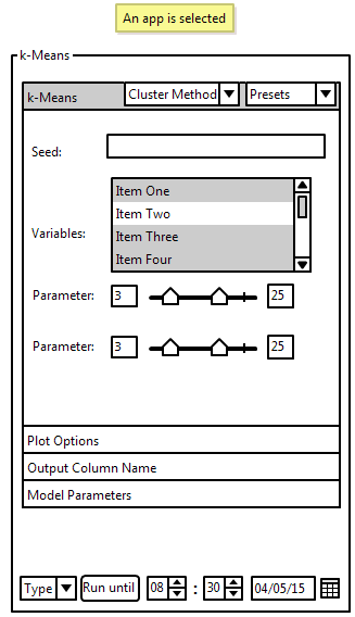

On the top is the seed. This text field only appears if the visualization method requires randomness. Leaving it empty will generate a new, random seed to be used. If a cluster is selected, the seed that was used to generate all runs is shown. Variables allows user to select which attributes they want to be used in the visualization of the selected data. For each parameter a slider is used to select the min and max values of this parameter. The slider with the lower value will be automatically the minimum and the slider with the larger value will be the maximum. It is also possible to enter a value into the text boxes next to the sliders. Those boxes display the current min and max. Little marks on the sliders show the default value for the min and max. Double-Clicking a slider will reset it to its default value. If a cluster is selected a histogram is shown above the slider, showing the distribution of this parameter across all clusters. The distribution of the parameter specifically of the selected cluster is highlighted. On the bottom is a button which lets the user start a run. There are multiple methods, which can be selected with the combo-box next to the button, of entering how many runs will be computed. If a cluster is selected, the user will have instead a use button. This transforms the current work pane, which is used for exploring all clusters, into the representative of the currently selected cluster.
Run Buttons
Those are the available methods of definig how long the program should run: Entering a time and date until when the program should be finished. This is most suitable for situations in which the user wants their program to run over night or over the weekend and want to resume working at a specific time. Entering the amount of time the program has. This will be used if the user only has a specific amount of time in which they wish to do something else (i.e. lunch break). Entering the exact amount of runs that should be computed. This will most likely only be used for testing purposes if the user just wants a couple runs to see if they selected reasonable parameters.
Presets
On the top right is a drop-down menu which allows the user to save a the current ranges for their parameters as a preset. It can also be used while exploring the data and using an already existing cluster as a preset. The user can also select already existing presets for the type of visualization they are using from the drop-down menu.
Filtering
Changing the values of the parameters while exploring, automatically filters the data. Loading presets while exploring has the same effect.
Sliders
The values of the sliders are set to predetermined default values. If there is no fixed maximum or minimum value for this parameter, then the start and/or the end are flexible. If both ends are flexible, the slider will be scaled that the default max value is at about 75% of the way on the slider and the minimum at about 25%. The user can drag a slider to a flexible end, where the slider graphic will stop, but the user can keep going with the mouse across the screen and change the value in this manner farther than the slider would initially allow for. Letting go of the slider after changing an extreme value rescales the slider in a way that the maximum is again at about 75% and the minimum at 25%.
Interactions with the Plots
Plots can be dragged from results window into a work pane to allow working with it or to be saved for later use. Double Clicking interacts with the plot, most often showing its children. The shown thumbnail of each cluster is the one that is the least different to all other clusters. It is therefore an actual cluster and can be used. Using the average to be displayed in each cluster might give better visual clues about the cluster, but is impractical, because its not a real cluster. Shift-Click selects multiple plots for comparison.
Zoom
Clicking the plus icon on top of the selected plot enlarges it quickly (animation) to cover the whole results pane. This can also be done for the graphical representation of the comparison of multiple nodes. Clicking the minus on top of the zoomed in node shrinks it back to normal size.
Tree
Two plots are shown next to each other for easy comparison. Double-Clicking shows its children. The move up button is used to move up one level in the hierarchy and display the parent of the currently shown nodes. It is the simplest way to visualize and compare two nodes. The advantage of this view is, that is very easy to understand and has almost no clutter or elements that distract the user from the task of exploring and comparing data. Of course this is also a problem, since there are no additional features and no context is provided to the user.
Hover
This one works just as the "Tree", but allows the user to hover over a node, which in return then displays its children in a tooltip. This feature could be also used with any other view. Additional nodes on display may be too much information at once, but allows the user to peek inside a given node before committing and actually exploring a given node. The size and position of the tooltip can be varied to achieve different goals. If the hover function is just supposed to provide a quick glance into the node, the tooltips could be very small disappear as soon as a user stops hovering over the node. The hover function could also be meant to be a way to actually compare the children of this node to the already shown nodes. It would be necessary to make them similarly big as their parent and let them be fixed by clicking on the node. They would only disappear again after a user clicks on a node that currently displays tooltips.
History
The currently selected node is displayed in the center of the screen, while its root is displayed above it and its children beneath it. This gives the user much needed context and allows them to better understand the underlying hierarchical structure of the data. Selecting a new node moves it into the center and displays it root above it and its children below it. This will be done via animation to not confuse the user.
File Browser
Each node can be "opened" like a directory to display its children. The size of each node is in relation to its distance, measured in edges, to the currently selected node. If a node is too far away it will be removed from the screen and only reappear, after a node is selected which is close enough to this node. The selected node also tries to move towards the center of the screen, but does so in a very soft approach to not disturb the currently established layout not too much. Clicking on a node "opens" it. A click on an already open node, closes it again.
Force Directed Layout
This view does not cluster the data into a hierarchical structure. It clusters all images that surpass a certain threshold, set by the user, in similarity. The slider used to regulate this threshold has histogram above it, to display the distribution of the clusters regarding the currently set threshold. There is no set amount of nodes per cluster and with a very high intra cluster threshold many clusters with just a single node may appear, while a lower threshold might lead to some very big clusters. The relative distance between each cluster encodes their similarity to each other. The absolute position of the clusters does not bear any meaning.
Spinner
Multiple horizontal lines are shown, each representing a layer in the hierarchy of the cluster tree. The size of each cluster depends on its distance towards the center, like a fisheye view. The horizontal lines can be grabbed by the user and moved left or right, to traverse the whole tree. Moving one layer moves all layers in the same way. Since cluster that were in the center get moved with the line to the edges of the screen new clusters appear in the center and become big. The whole tree is to be imagined as if it were painted on a cylinder, which can be rotated. This view would users quickly help to figure out how the overall tree is structured, since a lot of clusters a visible at any given moment, even if not all of them at the same time. The same problems, as with all distortions of space, arise. Since guessing distances is not really important, atleast not distances on the screen, and comparing relative sizes of objects is also not needed, these problems do not have a big impact. Distances are only important if measured in edges between nodes, because their actual geometric position does not encode anything. Size also does not matter and is only needed for the users themselves, because they actually need to look and understand the data.
Overview
The whole tree structure is layed out, centered around the root, in a grid-like structure and each cluster is represented with a small thumbnail. Hovering over a node enlarges the node. Clicking on it selects it and allows for same manipulations as for all nodes in the other views. This view could be used to give a user a general overview of the data, but also combined with other views to create context. It could be moved to the bottom-right corner of an other view and always highlight the currently selected node, to show the user where they currently are in comparison to the whole tree.
Expertise
I will be using Java, R, and Git all of which I am familiar with. It will also be necessary to use some biology specific R-Apps, but I do not think that those should be too difficult to understand.
Milestones
M2 - May 5+7
- [x] May 9: Meeting with Hamid
- [ ] May 10: Finalize selected visualization
- [ ] May 14: Implement parameter pane and allow for switching between new and old version
- [ ] May 17: Implement rudimentary view for the result window
- [ ] May 22: Allow basic comparison and filtering.
- [ ] May 24: Finish parameter pane (allow saving, loading and removing of presets, different input methods, etc.)
- [ ] May 28: Implement graphical representation of comparison between nodes and finish comparison pane
- [ ] May 29-June 1: BUFFER
M3 - June 2+4
- June 6: Meeting with Hamid
- June 16: Implement suggestions
- June 20: Clean up code, fix all major bugs
- June 21-22: BUFFER
M4 - Jun 23+25
- June 27: Meeting with Hamid
- June 28: Implement suggestions
- June 30: Final report
References
[1] M. Sedlmair, C. Heinzl, H. Piringer, S. Bruckner, and T. Möller. Visual Parameter Space Analysis: A Conceptual Framework. IEEE Transac- tions on Visualization and Computer Graphics / Proceedings IEEE Info- Vis 2014, 20(12):pp. 2161-2170, 2014.
[2] Torsney-Weir, T.; Saad, A.; Möller, T.; Hege, H.-C.; Weber, B.; Verbavatz, J.; Bergner, S., "Tuner: Principled Parameter Finding for Image Segmentation Algorithms Using Visual Response Surface Exploration," Visualization and Computer Graphics, IEEE Transactions on , vol.17, no.12
[3] Wilkinson, L.; Anand, A.; Grossman, R., "High-Dimensional Visual Analytics: Interactive Exploration Guided by Pairwise Views of Point Distributions," Visualization and Computer Graphics, IEEE Transactions on , vol.12, no.6, pp.1363,1372, Nov.-Dec. 2006
[4] Munzner, Tamara (2014): "Visualization Analysis and Design". CRC Press
[5] Michael Gleicher, Danielle Albers, Rick Walker, Ilir Jusufi, Charles D. Hansen, and Jonathan C. Roberts. 2011. Visual comparison for information visualization. Information Visualization 10, 4 (October 2011), 289-309.
[6] Schmidt, J.; Groller, M.E.; Bruckner, S., "VAICo: Visual Analysis for Image Comparison," Visualization and Computer Graphics, IEEE Transactions on , vol.19, no.12, pp.2090,2099, Dec. 2013
[7] Sedlmair, M.; Munzner, T.; Tory, M., "Empirical Guidance on Scatterplot and Dimension Reduction Technique Choices," Visualization and Computer Graphics, IEEE Transactions on , vol.19, no.12, pp.2634,2643, Dec. 2013
[8] Stephen Ingram, Tamara Munzner, Marc Olano, "Glimmer: Multilevel MDS on the GPU," IEEE Transactions on Visualization and Computer Graphics, vol. 15, no. 2, pp. 249-261, March/April, 2009
[9] Ingram, S.; Munzner, T.; Irvine, V.; Tory, M.; Bergner, S.; Möller, T., "DimStiller: Workflows for dimensional analysis and reduction," Visual Analytics Science and Technology (VAST), 2010 IEEE Symposium on , vol., no., pp.3,10, 25-26 Oct. 2010